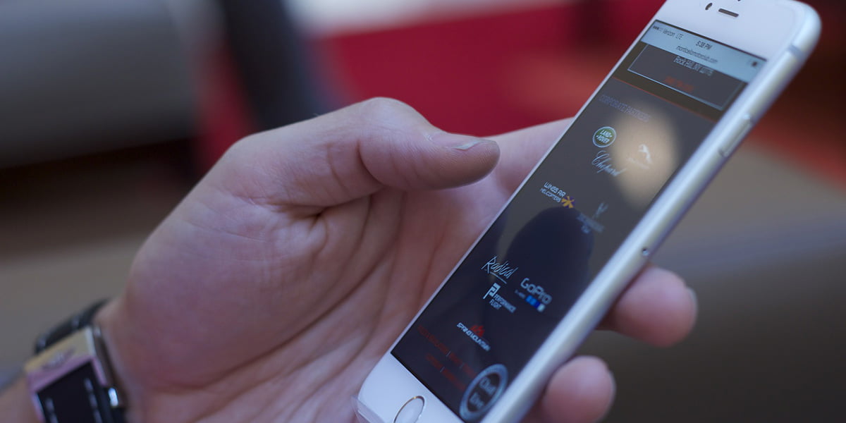
Today we received our first notification messages from Google that websites are now enabled for mobile-first indexing.
We predicted this last year and it basically means that Google will base its search results primarily on the content of your website’s mobile version, not the desktop version. You or your web developer should receive an email from Google for each site as they become enabled. In their own words:
“Mobile-first indexing means that Googlebot will now use the mobile version of your site for indexing and ranking, to better help our (primarily mobile) users find what they’re looking for. Google’s crawling, indexing, and ranking systems have historically used the desktop version of your site’s content, which can cause issues for mobile searchers when the desktop version differs from the mobile version.”
It also means that it’s more important than ever to get your mobile website in order. So, no more hiding content on mobile. Well, you can, but assume Google will never see it and therefore don’t expect any SEO value from that content. Layout is critical too so be sure to keep your important content towards the top of the page.
If your mobile site is designed and built properly then you’ll see this at the end of that Google notification:
“Our analysis indicates that the mobile and desktop versions of your site are comparable.”
If you don’t see this, then you need to fix your website’s mobile responsive version!
But fear not, we or your web developer can help. If you need an audit of your mobile responsive website or any support in reconfiguring your website’s responsiveness then give us a call. All websites we develop at Maroon Balloon are responsive. That’s mobile-friendly. They’re also properly SEO-configured and built with mobile efficiency in the forefront of our minds from the sitemapping and layout wire-framing stages.

